Sales Spotlight Visualization
Project information
Roles:
- Data Analyst
Key Skills:
- Data Cleaning
- Data Analysis
- Data Visualization
Summary
Spotlighting is a technique for showing discrete thresholds based on the values of a measure. You may want to colour-code a set of values so they will mean something to a viewer. In this personal project, I created a sales spotlight visualization to show sales of various products from 2011 to 2014.
Visualization
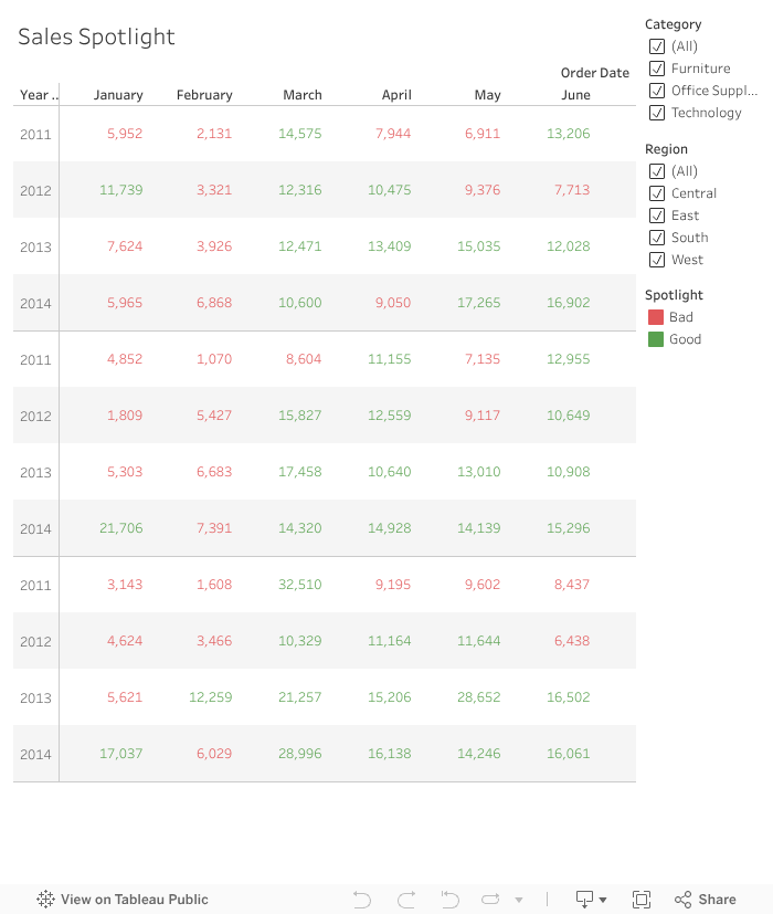
The visualization also has filters. Viewers will be able to filter the values based on regions and categories. If only Central Region is checked, the viewer will see the sales of the various product categories in Central Region. Also, if the user clicks on the Good or Bad filters, the values will be highlighted based on the viewer's selection. When a value is clicked, the viewer will see extra details about the sale including the profit.
From the visualization, we can see that:
- Sales are usually poor in the first two months of the year.
- Sales are usually good in the last two months of the year
- East region contributes majority of the good sales.
- Technology has the best sales.
Takeaways and Learnings
- How to clean and prepare data
- Data visualization techniques