London Bus Safety Visualization
Project information
Roles:
- Data Analyst
Key Skills:
- Data Cleaning
- Data Analysis
- Data Visualization
Summary
A dashboard showing the analysis of incidents on the London bus network from 2015 to 2018. The dashboard shows the occurrence of various incident types and the number of incidents that occur in each borough. It also gives a breakdown of the incidents per route, over time and season.
Visualization
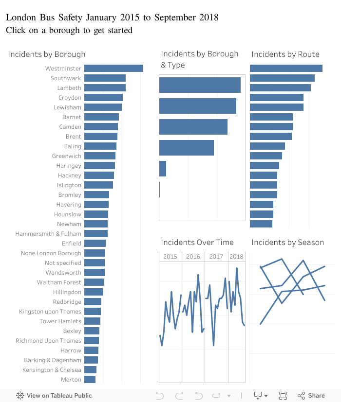
From the dashboard, we can see that:
- Westminster has the highest occurrence of incidents.
- On board Injuries make up the majority of Westminster's incidents
- Majority of these incidents occurred on route 24 in Westminster.
- November 2016 recorded the highest number of incidents in Westminster.
- Fourth quarter of 2016 recorded the highest number of incidents in Westminster
Takeaways and Learnings
- How to clean and prepare data
- Data visualization techniques